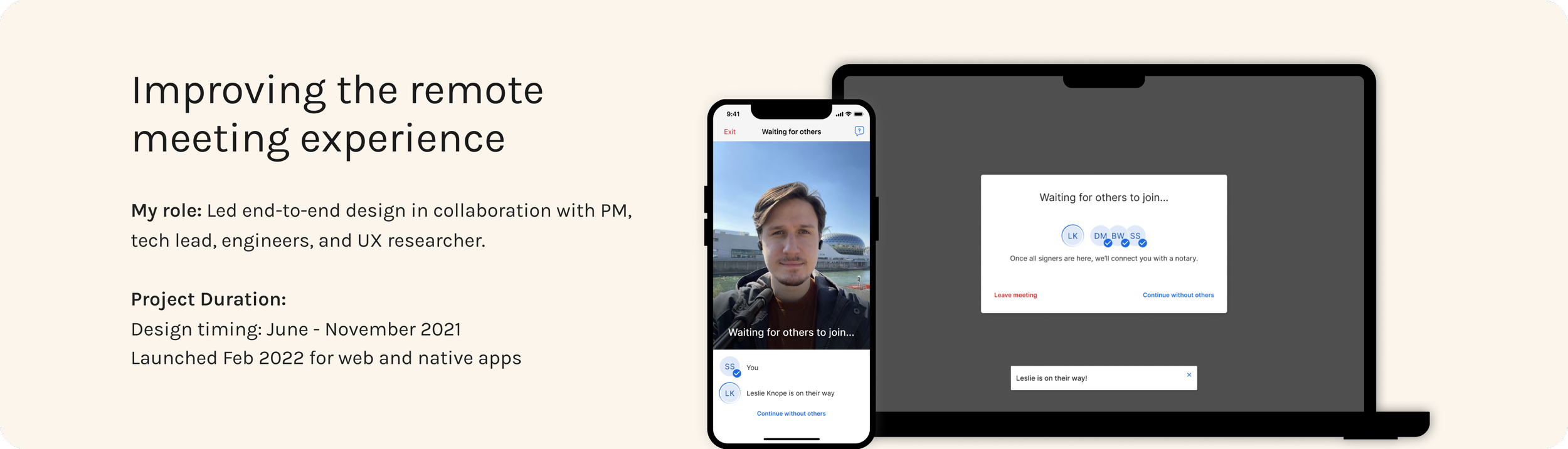
The Problem
On Notarize, 22% of transactions involve two or more signers joining a notary session remotely. The problem was that once signers received their invitation email, it was up to them to coordinate when to join the session.
This created an inefficient experience because:
Notaries and early signers were stuck waiting on the call
Notaries (especially contractors paid per meeting) lost valuable time during idle moments
Signers lacked guidance on the overall process when multiple signers were involved
Why solve this now? Notarize had recently launched support for remote multi-signer sessions, but the initial implementation was scrappy and unintuitive. In the post-Zoom era, a seamless remote meeting experience is table stakes – and we heard that loud and clear from our partners. AdobeSign flagged this as a blocker to growing their partnership with us. On top of that, the feature required manual enablement and training for each partner. A more intuitive UX would allow us to turn on remote signing for partners by default.

This visual helped align the team around all of the possible signing scenarios and the nuances of how they are supported in Notarize
Solution & Final Designs
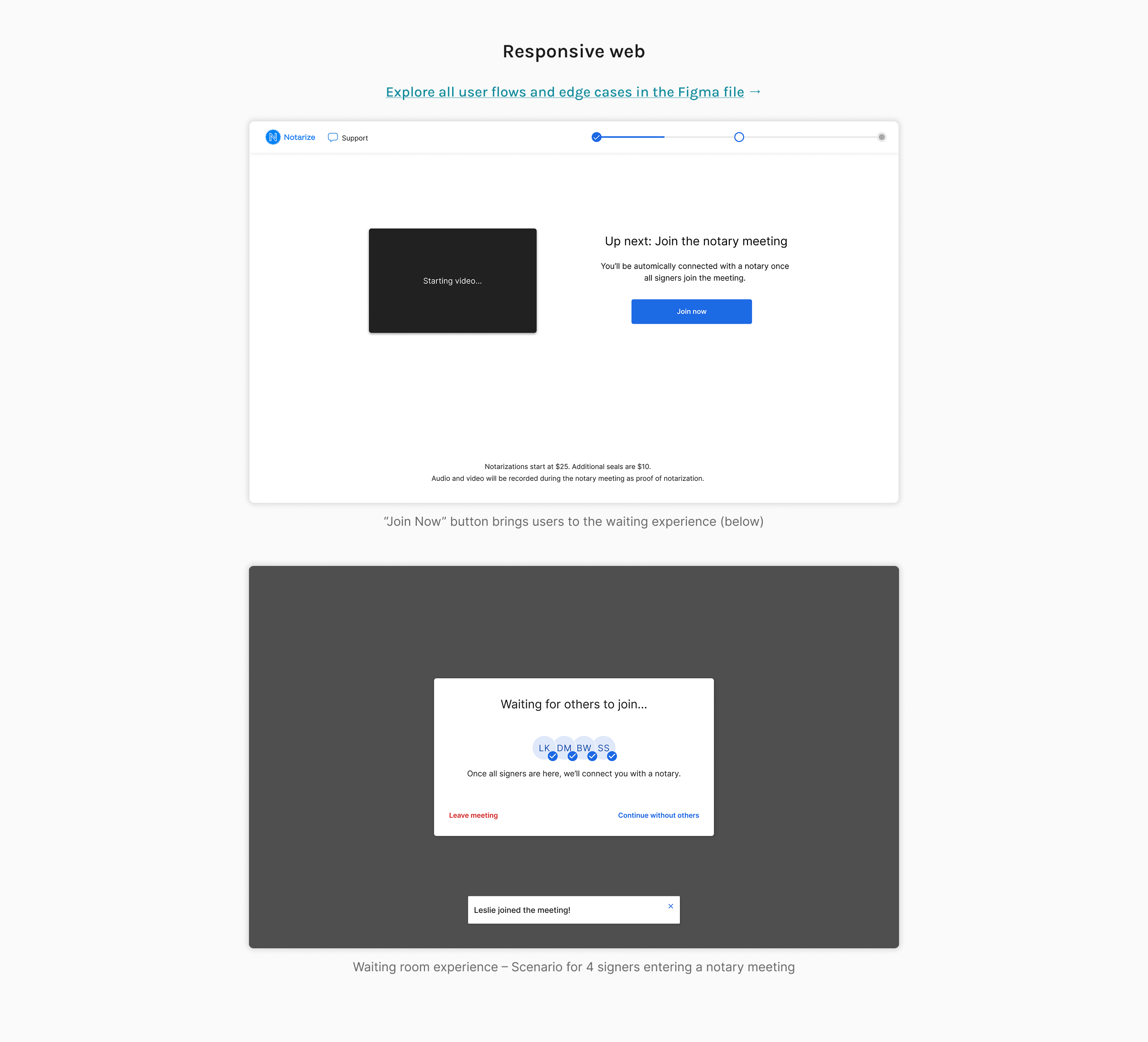
Spoiler alert! We introduced a virtual waiting room that holds signers after they verify their identity until all co-signers are ready, and then automatically connects them to the notary.
We hypothesized that this Zoom-like waiting experience would:
Reduce overall meeting times by encouraging signers to join at the same time
Save notary time by avoiding idle minutes waiting for co-signers
Improve clarity for signers heading into the meeting
Lay the groundwork to make remote co-signing the default
The waiting room was rolled out across web, iOS, and Android in early 2022 and quickly became the new standard for remote, multi-signer meetings.

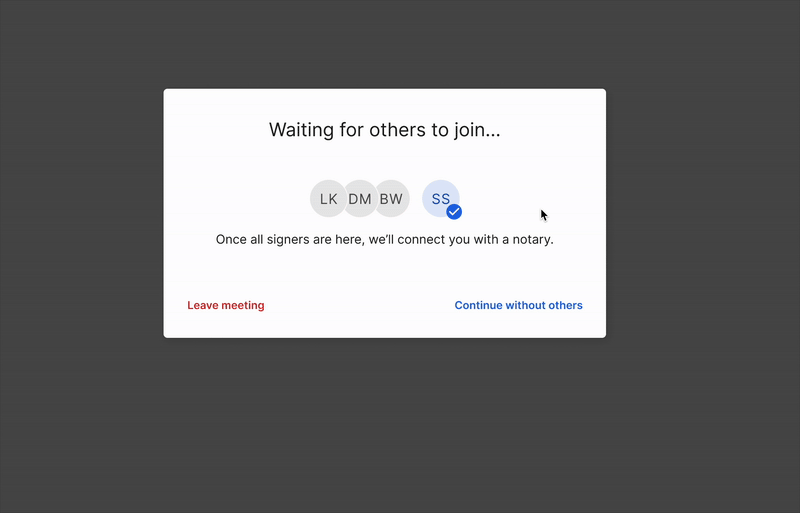
Gif showing waiting room microinteractions
Outcomes
⏱ 42% decrease in meeting time for multi-signer transactions
👥 More concurrent signer sessions, reducing total number of notary meetings
💸 Saved time for notaries, especially contractors who are paid per session
✅ Enabled us to roll out remote signings as a default option for more organizations
Exploring Possible Solutions
At the start of this project, our team explored moving in two possible directions:
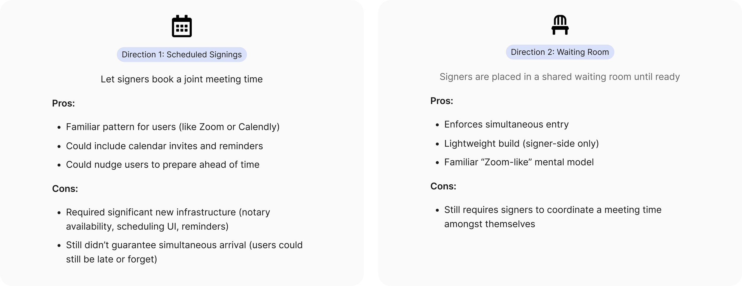
Current Experience
Before redesigning the multi-signer flow, I mapped out the full end-to-end signer experience to identify key friction points and edge cases.
In the end, the majority of the design work focused on replacing the following key screens:

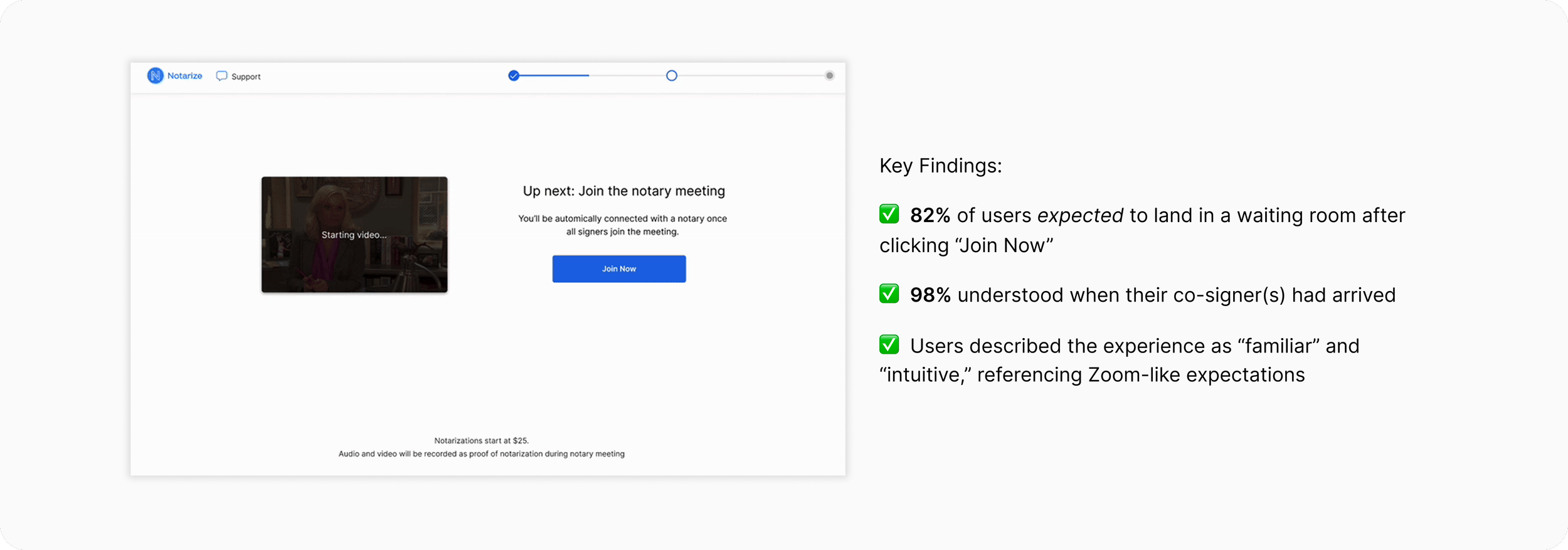
After verifying their identity, signers landed on a modal that initiates the notary call.
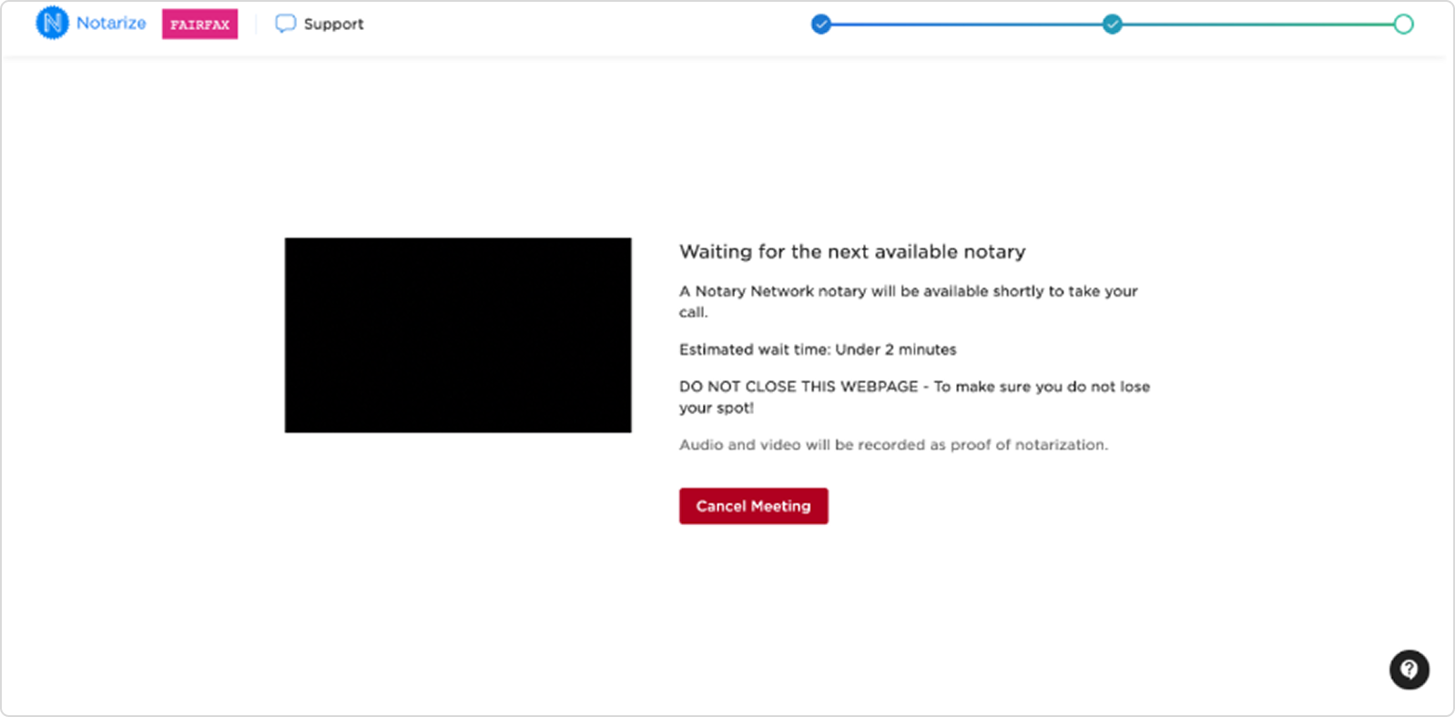
Next, signers land on this screen where they are automatically connected to the next available notary
Usability Testing
I built a detailed interactive prototype and partnered with our UX researcher to test it with users via UsabilityHub. We focused on testing expectations around the new Join now screen and the waiting room interactions.
Lessons & Reflections
Involving engineering early and often helped us catch important edge cases before dev began
Redesigning a flow often means revisiting and simplifying what’s already there
Small UX changes can deliver huge operational and business value
I'd love to evolve this feature with moments of delight (e.g. fun facts or visual cues in the waiting room)