The Problem
If I want to notarize a document on my mobile or tablet device, I have to download the Notarize app to complete my transaction. This causes me unnecessary friction, especially knowing that I won’t need to use this app again until the next time I need something notarized.
Motivations (why build this now?)
Customers want it - Many of our largest customers are asking for it (and they wanted it yesterday)
Better accessibility - Allows users to access Notarize from any device regardless of operating system, and makes it more accessible for users who don’t have the storage space or inclination to download an app
Cost-effective - Only needs to be developed once whereas a native app needs to be developed for each platform. Updates can also be made instantly versus updates for a native app need to be pushed out separately
Better SEO - Search engines optimize for websites that are optimized for mobile and rank them higher
Technology supports it - Most tablets have the processing power of a PC so there’s no reason not to support it
Hypothesis
We believed that allowing signers to complete meetings on mobile and tablet web would lead to these outcomes:
Increased completion rates on mobile and tablet by removing the barrier of downloading the app
Businesses will see a faster turnaround time in their customer’s completed transactions
Transitioning from app to responsive web will reduce engineering and release time for new features
Our Solution
The team decided we would release a fully responsive web experience, which included the video call between signer and notary. Our tech lead looked into feasibility and effort while I did the same for design effort.
The TL, PM and I ultimately broke this large undertaking into 3 phases:
Phase I: A scoped-down MVP that supports single signers only
Phase II: Ability to support transactions with multiple signers
Phase III: Unlocking the ability for signers to annotate their documents
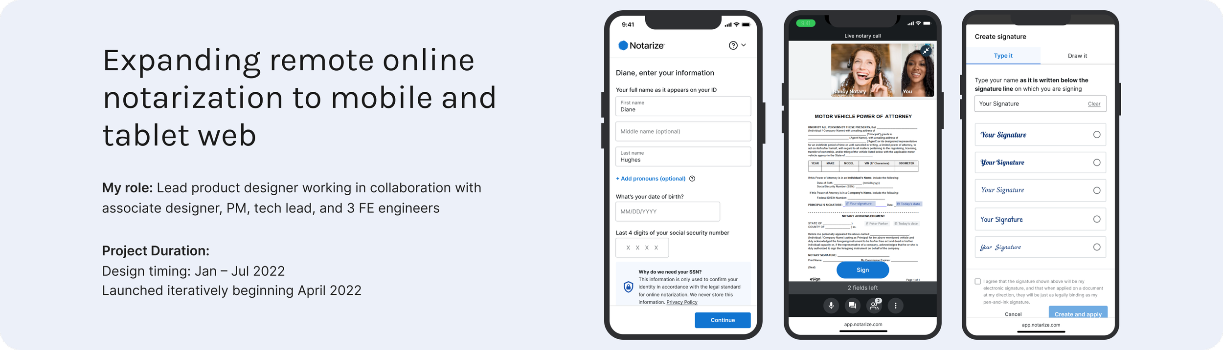
Phase I: Release MVP
Our goal was to limit scope and launch an MVP as soon as possible without compromising on experience.
Looking at the UX, there were two key parts of the experience that needed to be prioritized as a larger design effort:
Filling out your document prior to entering the meeting (i.e. text editing tools)
The notary video call which included a ton of functionality (video feeds, creating signatures, adding text, etc.)
The PM, TL and I worked together to make four key decisions to limit scope and move fast in Phase I:
We would remove the ability for signers to fill out their documents pre-meeting
We would rely on notaries to place signature fields on documents rather than have signers use the tools themselves
We would build an MVP of the in-meeting experience that mirrored our native app UX
We would only support single-signer meetings on mobile because we needed to learn more about performance over cellular networks
Gaining support for a UI Refresh
I knew we had to move fast, but I couldn’t ignore the fact that this was a rare opportunity to refresh Notarize’s UI. The UI had not been updated since 2014 and felt outdated, which posed a risk to our reputation as a trustworthy service – one of our core design principles.
Anticipating the team’s concerns about adding scope to our tight timeline, I presented a plan to improve the UI with minimal functional changes. The engineers were enthusiastic about the new designs and quickly pointed out that the refreshed UI would make the code much cleaner. By presenting a clear vision and demonstrating the benefits, I was able to gain buy-in from the team and move forward with the project.
Here’s a snapshot of what the old UI looked like:
Phase I High-Fidelity Designs
We released this first phase to select customers and received positive feedback . After this, we were confident enough releasing to all business customers.
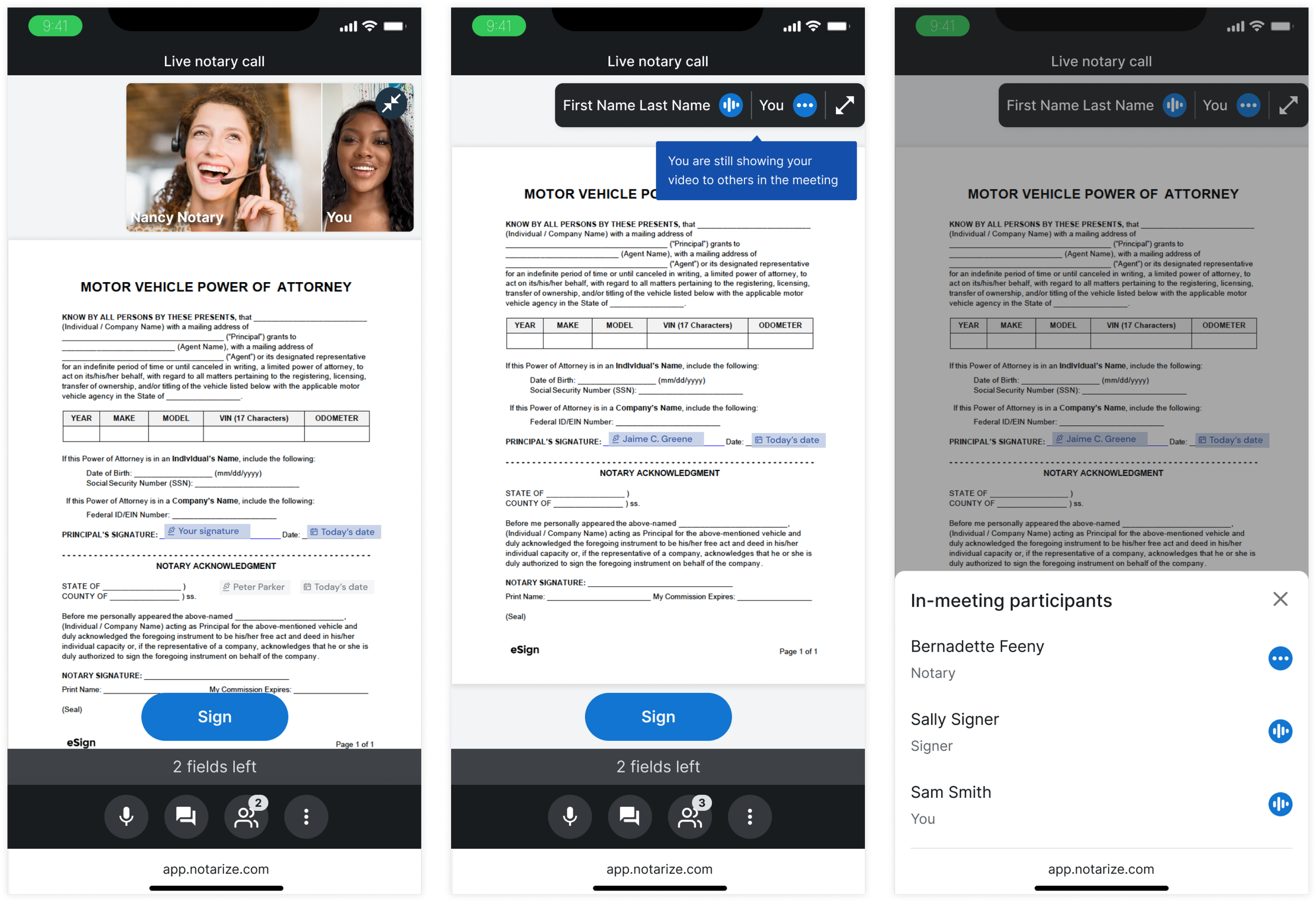
Phase II: Supporting multiple signers in meeting
Our next release aimed to unlock transactions with multiple signers, thereby enabling us to capture all the volume from our business customers.
I mentored an associate designer to lead this phase of the project. To ensure the project's success, I broke it down into smaller, manageable tasks, allowing her to tackle each one more effectively. We met regularly in working sessions so we could review work and work through any challenges she was facing in the design process. Through this process, I was able to support her growth as a designer and help her gain confidence in leading complex projects.
The final designs resulted in several exciting improvements:
The ability for the signer to see their video feed (previously they could only see the notary)
The option to collapse the videos and the ability to see audio feedback
The ability to view all the names of the participants in the meeting and their roles (e.g. signer, notary, title agent, etc)
As a bonus, we managed to sneak in some layout and UI improvements (i.e. moving the toolbar to the bottom and updating the colors to a dark theme)
Phase II High-Fidelity Designs
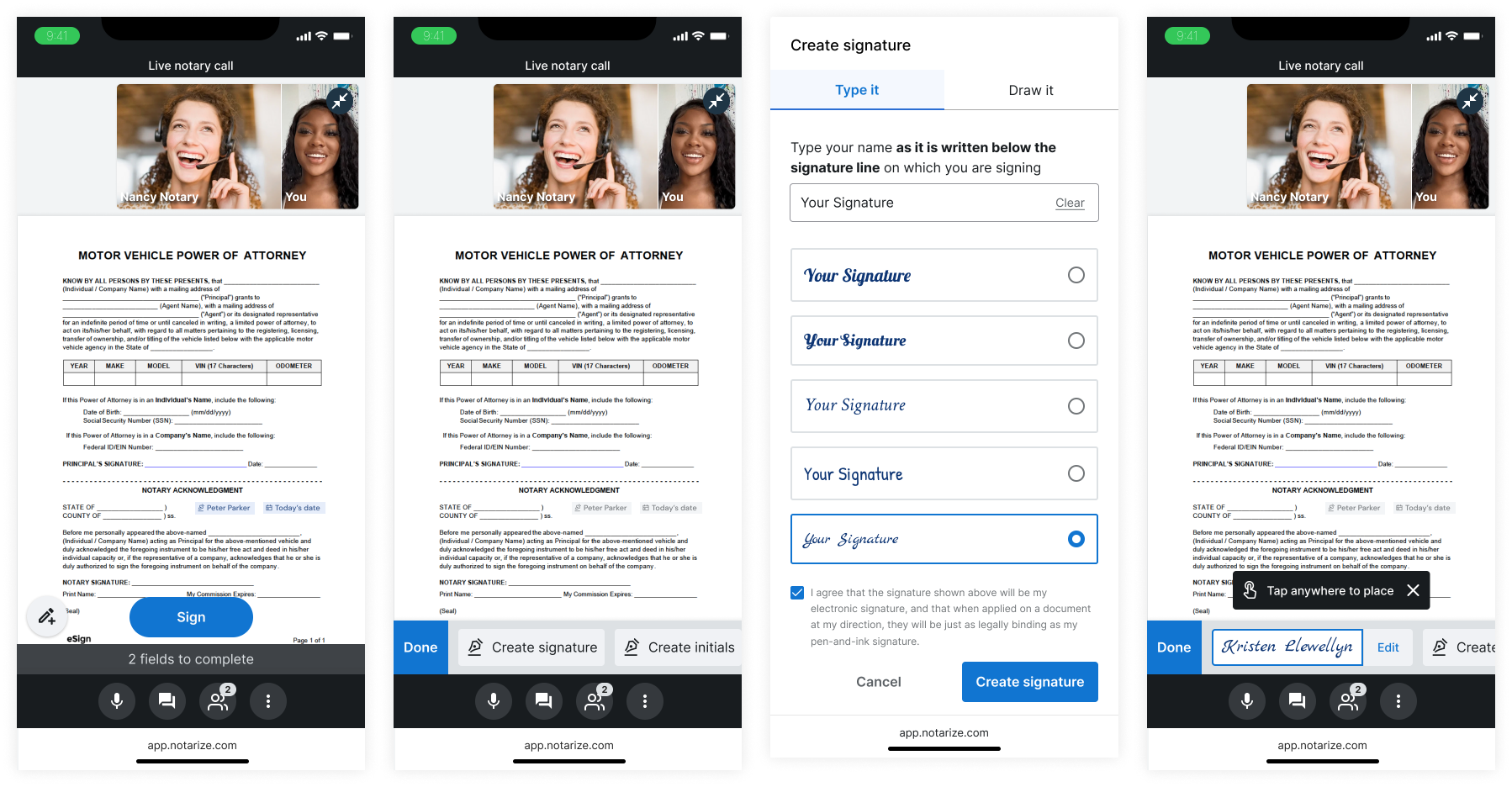
Phase III: Unlocking annotations on mobile web
The objective of this phase was to enable signers to add text to their documents before and during the notary meeting, along with the ability to create and place signatures during the meeting. This was an interaction-heavy project that required a comprehensive approach. I initiated the process by auditing our current native app's experience, which was neglected and buggy. Afterward, I gathered my team to analyze several products that allowed annotating documents on mobile web, as shown in the artifact below.
Team FigJam session analyzing different products
After our session, I explored multiple options for displaying the text tools. Our data indicated that signers often get confused by these tools on desktop, so it was crucial to make them less conspicuous. Additionally, not all signers would need to fill out their document on our platform, as they could have completed it using other PDF editing software, such as Adobe.

Two potential design directions
Phase III High-Fidelity Designs
I landed on a floating button that would reveal a toolbar. This worked well for both the pre-meeting and in-meeting UIs. The treatment of the floating button makes the action feel like a secondary tool rather than an action that the user must take to continue forward. The toolbar contains a text box option and a series of “pre-filled” fields such as date and signer name.
Adding annotations in the pre-meeting experience
View Prototype (the best way to experience it)

Adding annotations during the meeting
View Prototype (the best way to experience it)
Challenges
Tight timeline and pressure from senior leadership. This project had the eyes of the entire company on it. We had customers refusing to launch with Notarize until mobile web was complete.
Learnings and next steps
The best way to get buy-in oftentimes is to show people what it would look like. That is our superpower as designers!
When mentoring junior designers, it’s super important to break up large projects into smaller pieces to solve. And when you have critical feedback, always prepare ahead of time and give specific and actionable ways to improve.
Getting the team together to analyze other products’ UX was a great way to teach the team more about UX and gather a ton of insights quickly.